Website Notes Tips and instructions for editing this website.
Theme Options:
– Social Share Links
– Footer Signup Form
– Footer Call To Action Blocks
– Museum Info
– Museum Hours
WordPress Tutorials
This one is FROM WordPress https://learn.wordpress.com/
Pretty good review of 40 other tutorial sites HERE.
A paid course with lots of FREE TUTORIALS if you scroll down a bit.
NOTE
You will come across lots of information about the new WordPress editor called “Gutenberg”.
The Danforth site is very customized and as such is not using the Gutenberg editor. Perhaps in the future.
Your Tools
Every new Page, Artwork, Exhibition, Event or Course you create, and every content edit you make will be done using these tools.
All the content on all the pages in your admin has been broken up into manageable sections based on the design and display requirements.
By default WordPress provides a Title area and a Content area. Note that is several places the default content area just wasn’t necessary and was removed to reduce clutter.
Editing Pages, Artworks, Exhibitions, Events & Courses
As you work on your website you will be editing and entering content via input fields, drop-down selectors and a couple other types of editors. To reduce admin clutter the editors have been grouped according to function and placed in Tabs.
Within the tabs each field or editor will have a title stating exactly what it is and some will even have a small description.
Repeaters
Several tabs contain field ‘groups’ made with Repeater Fields or “Repeaters” for short.
Repeaters have sets of fields which can be added, removed and re-ordered very easily. Perfect examples are the Accordion Block commonly used for FAQs on this site. Each ‘set’ of fields contains the question and the answer.
Repeaters will have a button to “Add a Row” or “Add a Course Level” etc…
Tip:
- Repeater blocks can be minimized by hovering over the block and clicking the arrow at the top-right.
- By hovering over a block you will see the Plus and Minus signs on the right side. These are controls to delete the block or to add a new one.
- After the last Image block you will see an “Add Row”, this will also add another row of Image/Color-selector fields.
Not Shown: Blocks can be re-ordered by grabbing the left edge and dragging it into place.
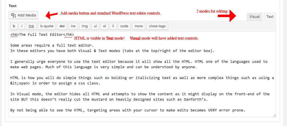
The WordPress Text Editor
The WordPress text editor provides both Visual & Text modes (tabs at the top/right of the editor box).
It is BEST to become familiar with both and not reliant on one or the other.
The Visual view provides icon buttonss for lots of text modifying tools – h1-h6 heading tags, lists, quotes, bold, italics, alignment, etc…
Text view is just plain text so while it doesn’t have as many text modifying icons in the tool bar, the HTML code is visible. Text view is great for finding mistakes and markup errors that can occur when using the Visual mode.
Tip:
Heading tags are perfect for areas where you want extra large text.
Heading 2 <h2></h2>, Heading 3 <h3></h3>, Heading 4 <h4></h4>, Heading 5 <h5></h5> and Heading 6 <h6></h6> create large text with h2 being the largest and h6 being about the same as normal text.
Heading 1 <h1></h1> is reserved for page titles and the site name for SEO reasons so it should not be used.
Mini Text Editors
Mini text boxes will have no bold or italics controls as they are meant for small amounts of letters, such as a Page Title or a section heading.
Post Object Dropdowns
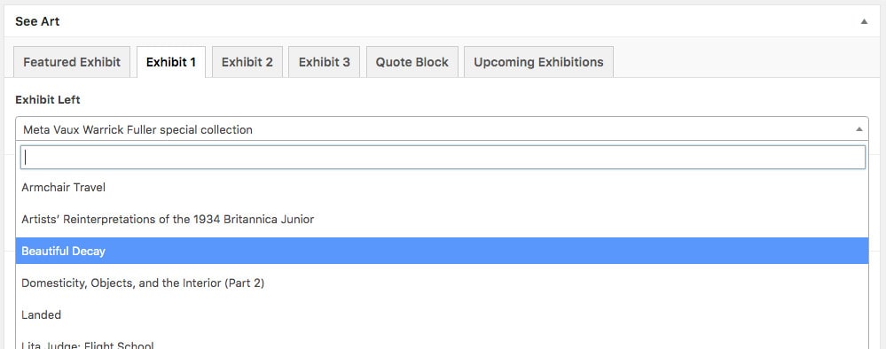
A drop-down selector loaded with entries from a content type. It could be Exhibitions as on SeeArt or Events as on the Calendar page.
Two Window Chooser
Similar in “function” to the above dropdown, this interface is for selecting a “Group” of related entries rather than just one. It is a dual window interface where the left side lists available posts and the right show the ones selected to display. Simply click one in the left to send it over to the right. Order can be set by drag-dropping the right-side posts around.
Link Tool
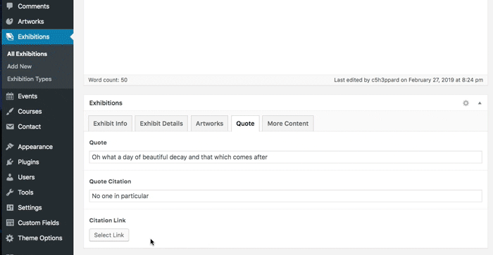
Image Tool
PAGE TYPES
WordPress comes with Pages & Posts as its 2 default content types.
The Danforth site currently has no use for Posts. For organizational and display purposes we have added Artworks, Exhibitions, Events & Courses.
Homepage
The homepage is special because it is what WP terms the Front Page… the page you get when there is nothing after the URL. The homepage is assigned in “Settings” in the admin. For convenience/clarity I named this page “Homepage”.
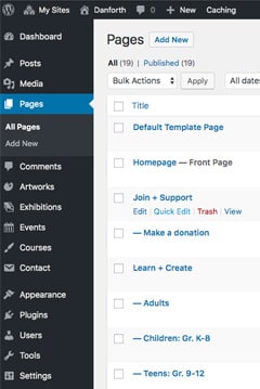
To edit: From the admin menu click “Pages”, then click on “Homepage” to get to the editor for this page.
WordPress Tip:
Hovering over a page title exposes the ‘quick menu’. In this quick menu there is a link for “Quick Edit”. This is a great shortcut interface for editing basic things such as the title, slug, publish date and a few others.
ARTWORKS
There are no tabs on Artworks. Use the main content area for the artworks main description.
Use WordPress’ featured image to load the Artwork’s image. Other content fields are labeled accordingly.
For Artworks that are part of the “Permanent Collection” be sure to select the appropriate ‘Collection Type’ taxonomy.
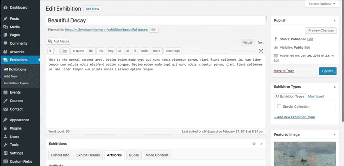
EXHIBITIONS
Exhibition content is divided up in tabs. Content is entered using the tools reviewed above.
The Featured Image will display as the page header & as the thumbnail image on the Past exhibition list.
The “Special Collection” (meta vaux) is determined by selecting the “Special Collection” Exhibition Type.
A “Past Exhibition” is identified by selecting the “Past Exhibition” Exhibition Type.
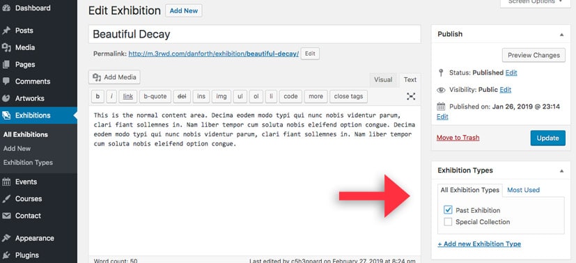
See Taxonomies for more information.
EVENTS
Events have no need for tabs. Use the main content area for the events main description.
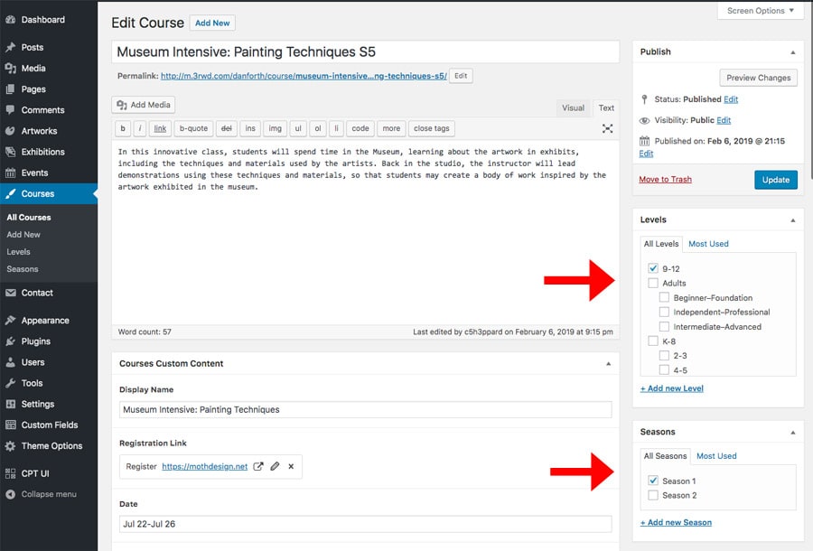
COURSES
Courses come in 2 flavors, Spring and Summer Arts.
These labels may change however due to the dual nature of Courses, some content fields will serve a dual purpose while others will only be used on one type of course.
Course titles will be your best visual cue for locating individual courses in the Admin.
I found it most helpful to append the level and day-of-week to the course title for easy ID.
Titles do not display on the front-end. There is however a field named “Display Name” which is what displays on the front end.
Order of Courses
Due to the complex sorting requirements AND the lack of suitable data fields for sorting – we must use the Publish Date as our sorting tool!
The most recent Courses will display first, the oldest last. By changing the publish dates you can order the courses however you like.
Note: this is easier said than done!
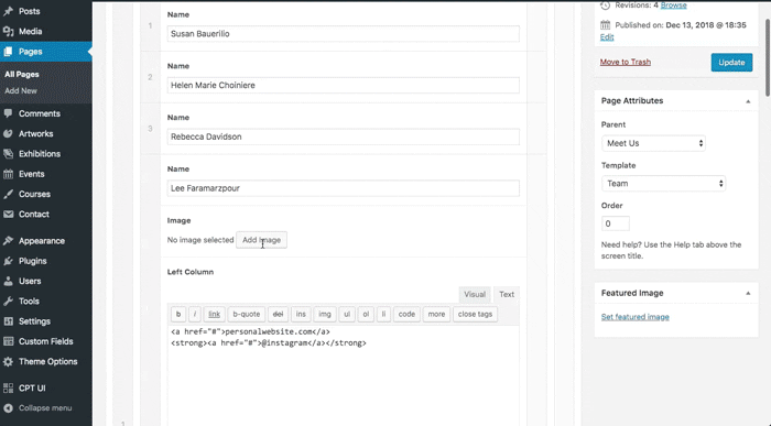
Instructor Links:
You will need to input the HTML code for the instructor links.
The format is as follows…
<a href="/meetus/team/#rdavidson">Rebecca Davidson</a>
These links will all be the same except for the Name and the Page Target which follows the # in the URL.
rdavidson = the “Page Target” field on each team member block on the Out Team page.
Course Taxonomies
As you’ve noticed Courses have 2 taxonomies, Level and Season.
Level: is the Grade levels. These are structured in a Parent/Child relationship. On a course page you will only be choosing a ‘child’ level (k-1,9-12,beginner/foundation). The ‘parent levels (k-8, teen, adult) are for use in the theme programming only.
Season: is how we separate Grade levels into 2 groups, Spring & Summer Arts or whatever is needed for the tab labels.
DEFAULT CONTENT PAGES
The default page template will be used if no other template is chosen.
The default template uses the modular approach by providing content blocks.
- Choose the preferred sub-menu from the drop-down drop-down, or leave as is for no sub-menu.
- Set your background color, or leave it white.
- Enter your content via the content modules.
PAGE SPECIFICS
HOMEPAGE Slider
Clicking the Slider Block tab will show the slider fields. For this repeater each ‘row’ contains an image field and a color selector. The color-selector is for the “Border Animations” that happen on each image.
The unique thing about this page is that these “Border Animations” are playing in sync to another, separate type of animation – the Background Color Transition.
The Border Animation and the Background Color Transition are done using different technologies, one is changing a color, the other is moving page elements.
Unfortunately, it is impossible to build an interface in WordPress that would allow control of or access to the code necessary to make changes to this animation/color-transition effect.
You can change the images, but there must be 5 and the color sequence must be remain Goldenrod, Sky, Aquamarine, Mocha, Tangerine.
Changing the amount of images or changing the color sequence will require a programmer.
SEE ART
Note that the “Collections” interface is a Repeater block with Text fields. Click the Add a Collection Block button to add a new section.
PERMANENT COLLECTION:
On this page you’ll find the usual tabs for each page section.
The “Collections” tab is a repeater, with each row containing two Post Choosers. The first id for the featured Artwork, the 2nd is for all the other Artworks in that section.
The “On-Page-Menu” is automatically generated from the Block Titles you enter.
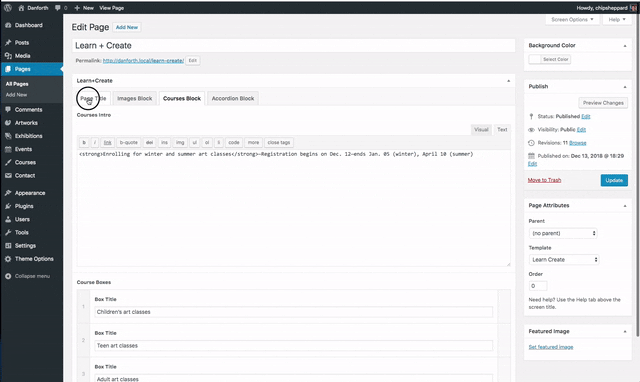
LEARN+CREATE:
The Course overview blocks are repeaters… that can contain another repeater for the 2 Vacation Blocks.
CHILDREN – TEEN & ADULT Course pages:
The Courses that display here are determined by the Season & the Level chosen in the first tab.
OUR TEAM:
The Team page is made using nested repeaters.
The 1st, outer repeater will add a row with yet another repeater. This 2nd, inner repeater will add Member fields. This inner repeater will only allow 4 members.
Ordering & re-ordering the Team Member blocks can be a little difficult as they are displayed in groups of 4 (so the 4 drop-down panels can all exist underneath the whole row).
Within a group of four you can drag-drop the order of members. You can also drag-drop the groups to re-order them.
Inserting a member into a pre-existing row however can be troublesome.
THEME OPTIONS
The “Theme Options” section of the Admin menu is set up similarly to a page. However, each of these tabbed sections handles content that occurs in multiple places throughout the site. This gives us a single, central place to edit the content areas.
Social Sharing:
Here is a shortcode from the plugin WP Social Sharing. Overrides are necessary here for styling to work therefore it is not advised to edit these unless you are aware of the extra html in the shortcodes.
Footer Signup:
A text editor for some introductory text and another shortcode. This shortcode is for the Contact Form plugin.
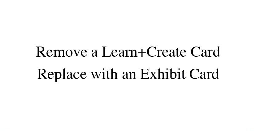
Footer CallToAction Blocks:
This is an area made to accommodate 2 blocks. There are however 3 block variations.
Using the “Add a Card” button you can choose an Event, Exhibit or Learn+Create card.
Event & Learn+Create cards are simply text and a link.
An Exhibit card will have the usual Exhibit dropdown, a color selector and a sub-title field.
Museum Info:
Left and right coliumns of text. LOTS of HTML being used for alignments.
NOTE: Be sure to use TEXT view to not disturb the code.
Museum Hours:
Fairly self explanatory interface. All 7 days of the week should be listed.
NOTE: Be sure to leave in the last row!! It is very important to the calculations.
If the museum is closed there is a “Not Open Message” field. Putting text in this box will deactivate the hours, place “Museum closed” in the header and the display the “Not Open Message”.
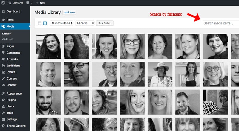
MEDIA LIBRARY
The media library is where all the images that you add to the site go.
Files are listed in the order that you loaded them and there are very few organizational tools!
After months or years of usage the media library can become difficult to work with if relying solely on visual identification. In order to maintain a productive work-flow it’s recommended that some type of system is developed for naming your image files.
It is also a good practice to avoid duplicate images. If the first image you try in a particular spot is not right and you need to replace it, be sure to delete the image you are replacing.
Note that there is a Search box here. This can come in very handy IF you remember what you named the file you are looking for.
HTML and UTILITY CLASSES
This theme has several CSS classes built in that can also be used to modify your content.
Below are some usage examples.
<div class="close"><span class="cssicon-x"></span></div>

<span class="to-left">“</span>
Available css classes are:
class=”red” for red text
class=”grn” for green text
class=”fwn” for font-weight-normal
class=”fwl” for font-weight-light
class=”big” makes font 25% larger
class=”ta-center” text align – Center (centers the text)
class=”ta-right” text align – Right
class=”to-left” Used for asterisks or quotes that need to exist outside their containing block.
class=“circle-num” white character, black background, used in alert (course session #s)
This is the code for adding a circled number to an unordered list
<span class="circle-num to-left">1</span>
Alternate Characters
This theme is using a specialized font that provides “Alternate” characters for several letters. To access these alternate characters a CSS class is required. To make things as easy as possible the class is simply “af” for Alternate Fonts.
To use the alternate font wrap the characters you wish to affect in a span with the ‘sf’ class…
Text f<span class="af">or</span> yo<span class="af">u</span>.
The above would result in the letters o, r and u in the alternate font.
TAXONOMIES
A taxonomy is simply a “scheme of classification”. The most well-known taxonomies are called Tags. Their functionality is well demonstrated by the “Hashtag” on Twitter… it’s a link, you click it and you are taken to a page showing all tweets that have been tagged or contain that same hashtag.
Taxonomies are used extensively throughout the Danforth WordPress theme.
For Artworks they are used to identify Past Exhibitions & to identify the Special Collection.
For Courses they are used to mark Grade Levels, the Season and the Vacation Week courses.
Taxonomies are managed along with the Post Type they are assigned to.
Artworks have “Collection Types” (used for the sections of the permanent collection)
Exhibitions have “Exhibition Types” (to identify past exhibitions and the special collection)
Courses have Seasons and Levels.
All of these, especially Levels, are set up in specific ways to interact with the theme. Therefore, even though they are readily editable, it is advised to not edit or delete or add to any of these.
Recommended Image Sizes
| Featured Images & Home-Slider | 1600×750 |
| Mid-Block images | 800×740 |
| Tall mid-block images | 800×1024 |
| Smaller images | 400 wide. |
| Social Squares | 300×300 |
| Courses | 420×285 |
| Team Members | 400×200 |
Videos
Add an Artwork
Then add it to the Permanent Collection.
Add an Exhibition
Then Display it on the Past Exhibitions page in 2 spots.
Add a Course
Then use the Publish Date to re-order it. Then correct a small typo!
Add an Alert
! The extra code in the Widget that adds the X (to close) and the Exclamation point in the black circle is as follows…
<div class="close"><span class="cssicon-x"></span></div>
<span class="circle-num">!</span>

Hey hey, my, my, Rock and Roll can never die. Neal Young—http://neilyoung.com
Donate to the Danforth — Your support helps fund exhibitions, programs and scholarships.